7. Matplotlib#
7.1 Introduction#
Matplotlib is a Python module that allows you to create visualizations. Until now, you have probably used Excel to make graphs, but Python offers much more versatility. In this section, you will learn how to use matplotlib to make good-looking graphs.
As always, let’s import the module. We will also import numpy and pandas.
import matplotlib.pyplot as plt
import numpy as np
import pandas as pd
From the matplotlib library we will discuss the following functions:
plt.subplot()plt.plot()plt.title()plt.suptitle()plt.xlabel()andplt.ylabel()plt.xlim()andplt.ylim()plt.legend()plt.grid()plt.show()
7.2 Simple plot#
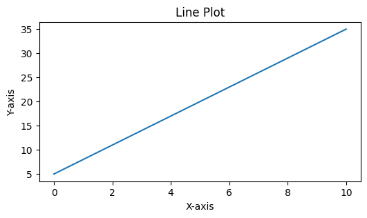
Let’s start by creating a simple line plot of the equation \(y=3x+5\). We will use numpy to create an array which acts as our x-axis
x = np.linspace(0,10)
y = 3*x + 5

plt.figure(figsize=(6,3))
plt.plot(x, y)
plt.xlabel('X-axis')
plt.ylabel('Y-axis')
plt.title('Line Plot')
plt.show()
Let’s break it down
Here’s a breakdown of what each line does:
x = np.linspace(0, 10): This line generates a sequence of evenly spaced numbers between 0 and 10.np.linspace()creates an array of numbers with a specified start and end point.y = 3*x + 5: This line calculates the values for the y-axis based on the values of x. It uses a simple equation3*x + 5, which means each y-value is obtained by multiplying the corresponding x-value by 3 and adding 5.plt.figure(figsize=(6,3)): This line creates a new figure (or plot) with a specified size. Thefigsizeparameter sets the width and height of the figure. In this case, the width is 6 units and the height is 3 units.plt.plot(x, y): This line plots the x and y values on the figure. It takes the x and y values as input and connects them with a line.plt.xlabel('X-axis'): This line sets the label for the x-axis of the plot to ‘X-axis’.plt.ylabel('Y-axis'): This line sets the label for the y-axis of the plot to ‘Y-axis’.plt.title('Line Plot'): This line sets the title of the plot to ‘Line Plot’.plt.show(): This line displays the plot on the screen.plt.show()is a function that shows the plot that has been created.
7.3 Customizing the Plot#
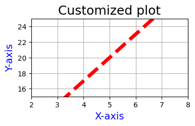
matplotlib provides numerous options for customizing your plots. Let’s make some modifications to our previous plot.
plt.figure(figsize=(4,2))
plt.plot(x, y, linestyle='--', linewidth=5, color='r')
plt.xlim(2, 8)
plt.ylim(15, 25)
plt.xlabel('X-axis', fontsize=14, color='b')
plt.ylabel('Y-axis', fontsize=14, color='b')
plt.title('Customized plot', fontsize=18)
plt.grid(True)
plt.show()
Let’s break it down
plt.figure(figsize=(4,2)): Creates a new plot with a width of 4 units and height of 2 units.plt.plot(x, y, linestyle='--', linewidth=5, color='r'): Plots the x and y values with a dashed line style, a line width of 5 units, and a red color.plt.xlim(2, 8): Sets the x-axis limits to range from 2 to 8.plt.ylim(10, 30): Sets the y-axis limits to range from 15 to 25.plt.xlabel('X-axis', fontsize=14, color='b'): Adds a blue x-axis label with a font size of 14 units.plt.ylabel('Y-axis', fontsize=14, color='b'): Adds a blue y-axis label with a font size of 14 units.plt.title('Customized plot', fontsize=18): Sets the plot’s title to ‘Customized plot’ with a font size of 18 units.plt.grid(True): Adds a grid to the plot.plt.show(): Displays the plot on the screen.
7.4 Scatter plot.#
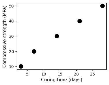
A scatter plot is a type of plot used to display the relationship between two variables. In civil engineering, scatter plots can be used to analyze various aspects of data. Let’s consider a scenario where civil engineers are studying the relationship between the compressive strength of concrete and the curing time. To investigate this relationship, the engineers collect data from concrete samples. For each sample, they measure the compressive strength after different curing times. The collected data might look like this:
Curing Time (days) |
Compressive Strength (MPa) |
|---|---|
3 |
18 |
7 |
28 |
14 |
38 |
21 |
46 |
28 |
55 |
To visualize this data, the engineers can create a scatter plot, where the x-axis represents the curing time in days, and the y-axis represents the compressive strength in megapascals (MPa). Each data point in the plot corresponds to a specific curing time and the corresponding compressive strength. By examining the scatter plot, the civil engineers can observe the trend or pattern of the data points. They can determine if there is a correlation between curing time and compressive strength, and analyze how the strength changes with the increase in curing time.
Let’s create the corresponding scatter plot:
curing_time = [3,7,14,21,28]
compressive_strength = [10,20,30,40,50]

fig, ax = plt.subplots(figsize = (4,3))
ax.scatter(curing_time, compressive_strength, color='black', s=100)
ax.set_xlabel('Curing time (days)', fontsize=11)
ax.set_ylabel('Compressive strength (MPa)', fontsize=11)
plt.show()
Let’s break it down
curing_time = [3,7,14,21,28]andcompressive_strength = [10,20,30,40,50]: These lines define two lists representing the curing time and corresponding compressive strength data points.fig, ax = plt.subplots(figsize=(4, 3)): This line creates a plot with a figure size of 4 units wide and 3 units high. The plot will contain the figure (fig) and axes (ax) objects.ax.scatter(curing_time, compressive_strength, color='gray', s=100): This line creates a scatter plot using the data fromcuring_timeandcompressive_strength. The dots are colored gray and have a size of 100 units.ax.set_xlabel('Curing time (days)', fontsize=11): This line sets the x-axis label as ‘Curing time (days)’ with a font size of 11 units.ax.set_ylabel('Compressive strength (MPa)', fontsize=11): This line sets the y-axis label as ‘Compressive strength (MPa)’ with a font size of 11 units.plt.show(): This line displays the plot on the screen.
Note
Notice the line fig, ax = plt.subplots(figsize=(8, 6)).
When plotting with matplotlib, we often work with two main objects: the figure (fig) and the axes (ax).
The figure (
fig) is the entire window or page that everything is drawn on.The axes (
ax) represents the actual plot or chart area within the figure.
This is special helpful when dealing wit multiple subplots.
7.5 Histograms#
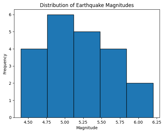
A histogram is a graphical representation of the distribution of a dataset. It consists of a set of rectangular bars, where the width of each bar represents a range of values, and the height of each bar represents the frequency or count of data points falling within that range. Histograms are commonly used to visualize the distribution and frequency of data in various fields, including geosciences. For example, the study of earthquakes often involves analyzing the distribution of earthquake magnitudes. The magnitudes of earthquakes can provide valuable insights into the frequency and severity of seismic events.
Let’s consider a scenario where we have a dataset containing earthquake magnitudes. We want to visualize the distribution of these magnitudes using a histogram.
earthquake_magnitudes = [4.5, 5.2, 4.8, 5.7, 4.9, 6.2, 5.1,
                        5.5, 4.6, 5.9, 5.3, 4.7, 5.8, 4.4,
                        4.8, 5.1, 5.3, 5.2, 4.9, 5.4, 5.6]

plt.hist(earthquake_magnitudes, bins=5, edgecolor='black')
plt.xlabel('Magnitude')
plt.ylabel('Frequency')
plt.title('Distribution of Earthquake Magnitudes')
plt.show()
Let’s break it down
In the example, we first define the earthquake magnitudes in the earthquake_magnitudes list. We then create a histogram using plt.hist(), where earthquake_magnitudes is the data, and bins=5 specifies the number of bins or bars in the histogram. The edgecolor='black' parameter sets the color of the edges of the bars.
We then set the x-axis label as ‘Magnitude’, the y-axis label as ‘Frequency’, and the title as ‘Distribution of Earthquake Magnitudes’ using the appropriate plt.xlabel(), plt.ylabel(), and plt.title() functions.
Finally, we display the histogram on the screen using plt.show().
The resulting histogram will visualize the distribution of earthquake magnitudes, showing the frequency of magnitudes falling within each bin. This information can help geoscientists understand the distribution and characteristics of earthquakes in the studied region.
7.6 Subplots#
In Python, subplots refer to the division of a single figure into multiple smaller plots or subplots. Each subplot is an independent plot area within the larger figure. Subplots are useful when you want to display multiple plots or visualizations side by side or in a grid-like arrangement.
The subplots() function in the matplotlib library is used to create subplots. It allows you to specify the number of rows and columns in the subplot grid, which determines the overall layout of the subplots.
Here’s an example to help you understand subplots. We will use the dataset of a sample of 100 vehicles corresponding to the 3-axle vehicle type 3C (remember the Maximum bending moment on a simply supported bridge example on numpy section?)
First we will read the data set using pandas
dataset = pd.read_csv("https://raw.githubusercontent.com/"
                "mike-mendoza/Bivariate_NPBN_workshop_files/"
                "a991bc3d9391a92437af1c3d69ae9fdfe6baf6da/"
                "files_pyhton_book_test/V3AX_WIM_BR.csv")
dataset.head()
| A1_kN | A2_kN | A3_kN | D1_m | D2_m | |
|---|---|---|---|---|---|
| 0 | 42.1 | 77.5 | 65.3 | 5.1 | 1.4 |
| 1 | 48.7 | 80.1 | 50.2 | 5.4 | 1.2 |
| 2 | 51.7 | 90.2 | 61.6 | 5.2 | 1.2 |
| 3 | 41.2 | 75.7 | 58.6 | 5.4 | 1.2 |
| 4 | 25.0 | 48.4 | 33.5 | 5.6 | 1.2 |
Let’s create one figure with one histogram per colum in the dataset using for loop.
variable_names = ['Axle 1', 'Axle 2', 'Axle 3',
                   'Inter-axle distance 1', 'Inter-axle distance 2']

xlabels =['Weight [kN]', 'Weight [kN]', 'Weight [kN]',
           'Distance [m]', 'Distance [m]']

fig, axes = plt.subplots(nrows=1, ncols=5, figsize=(12,3))
for i,column in enumerate(dataset.columns):
    axes[i].hist(dataset[column])
    axes[i].set_xlabel(xlabels[i])
    axes[i].set_ylabel('Frequency')
    axes[i].set_title(variable_names[i])
plt.suptitle('Histograms of variables in the dataset')
plt.tight_layout()
plt.show()
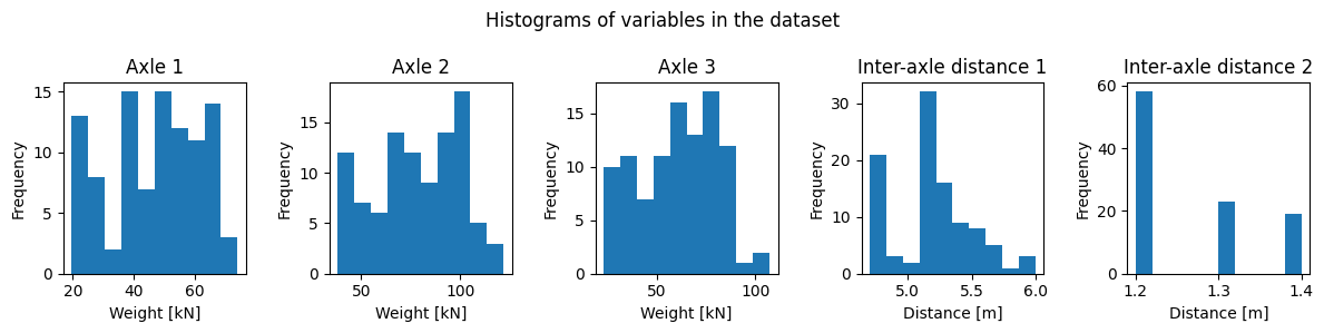
Let’s break it down
variable_namesis a list containing the names of different variables in a dataset.xlabelsis a list containing the x-axis labels for each histogram.The code creates a figure with 1 row and 5 columns of subplots using
plt.subplots(nrows=1, ncols=5, figsize=(12, 3)).for i, column in enumerate(dataset.columns)initiates a loop that iterates over the columns of the dataset. It uses theenumerate()function to retrieve both the index (i) and the column name (column) at each iteration.It then loops over the columns of the dataset and creates a histogram for each column using
axes[i].hist(dataset[column]).The x-axis label, y-axis label, and title of each subplot are set using
axes[i].set_xlabel(xlabels[i]),axes[i].set_ylabel('Frequency'), andaxes[i].set_title(variable_names[i]), respectively.The super title for the entire figure is set using
plt.suptitle('Histograms of variables in the dataset').plt.tight_layout()adjusts the spacing between subplots.Finally,
plt.show()displays the figure with all the subplots.