7. Matplotlib#
7.1 Introduction#
Welcome to the fascinating world of matplotlib! Matplotlib is a powerful Python module that empowers you to create impressive visualizations. If you’re tired of basic graphs in Excel, matplotlib is your gateway to a new level of creativity and versatility. With it, you can bring your data to life by crafting captivating graphs that effectively communicate your insights. In this section, you’ll learn how to harness the power of matplotlib to create visually appealing and engaging graphs.
We first start by importing it:
import matplotlib.pyplot as plt
The most frequently used functions in matplotlib are summarized in the table below:
Function |
Description |
Usage |
|---|---|---|
plt.figure( ) |
Create a new figure or activate an existing figure |
plt.figure() |
plt.subplot( ) |
Create subplots within a figure |
plt.subplot(num_rows, num_cols, plot_index) |
plt.plot( ) |
Create line plot or scatter plot |
plt.plot(x, y, options) |
plt.title( ) |
Set the title of the current axes |
plt.title(‘Title’) |
plt.suptitle( ) |
Set the super title of the entire figure |
plt.suptitle(‘Super Title’) |
plt.xlabel( ) |
Set the label for the x-axis |
plt.xlabel(‘X-axis label’) |
plt.ylabel( ) |
Set the label for the y-axis |
plt.ylabel(‘Y-axis label’) |
plt.xlim( ) |
Set the limits for the x-axis |
plt.xlim(x_min, x_max) |
plt.ylim( ) |
Set the limits for the y-axis |
plt.ylim(y_min, y_max) |
plt.legend( ) |
Add a legend to the plot |
plt.legend() |
plt.grid( ) |
Display grid lines on the plot |
plt.grid(True/False) |
plt.show( ) |
Display the figure |
plt.show() |
plt.close( ) |
Close the figure window |
plt.close() |
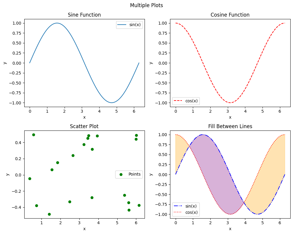
Below is an example to illustrate how to use these functions professionally. We will utilize numpy and matplotlib to generate multiple plots in a single figure. We create four subplots, each representing a different type of graph. In the first subplot, we create a line plot of the sine function, while in the second subplot, we display a line plot of the cosine function. Moving on to the third subplot, we generate a scatter plot of randomly generated points. Lastly, in the fourth subplot, we create a line plot with a filled area between the sine and cosine functions.
To enhance the visual appeal, we customize each plot with titles, axis labels, and legends. Finally, we display the figure, presenting our multiple plots in an engaging and visually appealing manner.
import numpy as np

x = np.linspace(0, 2 * np.pi, 100)
y_sin = np.sin(x)
y_cos = np.cos(x)

plt.figure(figsize=(10, 8))

plt.subplot(2, 2, 1)
plt.plot(x, y_sin, label='sin(x)')
plt.title('Sine Function')
plt.xlabel('x')
plt.ylabel('y')
plt.legend()

plt.subplot(2, 2, 2)
plt.plot(x, y_cos, label='cos(x)', color='r', linestyle='--')
plt.title('Cosine Function')
plt.xlabel('x')
plt.ylabel('y')
plt.legend()

plt.subplot(2, 2, 3)
x_points = np.random.rand(20) * 2 * np.pi
y_points = np.random.rand(20) - 0.5
plt.scatter(x_points, y_points, color='g', label='Points')
plt.title('Scatter Plot')
plt.xlabel('x')
plt.ylabel('y')
plt.legend()

plt.subplot(2, 2, 4)
plt.plot(x, y_sin, label='sin(x)', color='b', linestyle='-.')
plt.plot(x, y_cos, label='cos(x)', color='r', linestyle=':')
plt.fill_between(x, y_sin, y_cos, where=(y_sin >= y_cos), interpolate=True, alpha=0.3, color='purple')
plt.fill_between(x, y_sin, y_cos, where=(y_sin <= y_cos), interpolate=True, alpha=0.3, color='orange')
plt.title('Fill Between Lines')
plt.xlabel('x')
plt.ylabel('y')
plt.legend()


plt.suptitle('Multiple Plots')
plt.tight_layout()

plt.show()
Note
plt.tight_layout( ) is used to adjust spacing between subplots
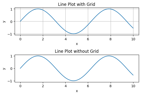
Below is an example to illustrate the difference between plots that use the plt.grid( ) function:
x = np.linspace(0, 10, 100)
y = np.sin(x)

plt.figure(figsize=(6, 4))

plt.subplot(2, 1, 1)
plt.plot(x, y)
plt.title('Line Plot with Grid')
plt.xlabel('x')
plt.ylabel('y')
plt.grid(True)

plt.subplot(2, 1, 2)
plt.plot(x, y)
plt.title('Line Plot without Grid')
plt.xlabel('x')
plt.ylabel('y')

plt.tight_layout()

plt.show()
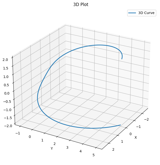
3D plots#
Matplotlib can also create 3D plots. Below is a simple example. You can try to plot different functions, larger ranges, or anything you want.
import numpy as np
import matplotlib.pyplot as plt
from mpl_toolkits.mplot3d import Axes3D

theta = np.linspace(0, 2 * np.pi, 100)
z = np.linspace(-2, 2, 100)
r = z**2 + 1
x = r * np.sin(theta)
y = r * np.cos(theta)

fig = plt.figure(figsize=(8, 8))
ax = fig.add_subplot(111, projection='3d')

ax.plot(x, y, z, label='3D Curve', linewidth=2)

ax.set_xlabel('X')
ax.set_ylabel('Y')
ax.set_zlabel('Z')
ax.set_title('3D Plot')
ax.legend()

ax.grid(True)

ax.view_init(elev=25, azim=30)

plt.show()
Note
The line “from mpl_toolkits.mplot3d import Axes3D” imports the Axes3D module from the mpl_toolkits.mplot3d package. This module provides the necessary tools and functions for creating 3D plots in matplotlib.